Your painting feels flat despite careful attention to values and shapes because you're missing the most powerful compositional tool in your arsenal: color temperature. Understanding the relationship between warm and cool colors transforms muddy, lifeless paintings into dynamic compositions that pull viewers into your world through strategic temperature shifts.
Why Color Temperature Controls Visual Impact More Than Hue Choice
Color temperature refers to the relative warmth or coolness of colors, independent of their actual hue. Winsor & Newton's color theory research demonstrates that viewers perceive warm colors (reds, oranges, yellows) as advancing toward them, while cool colors (blues, purples, greens) recede into the distance. This optical phenomenon creates spatial depth without relying on perspective drawing alone.
The secret lies in temperature bias within each color family. Even "warm" colors contain cool versions—cadmium red versus alizarin crimson, for instance. Alizarin crimson leans blue, making it cooler than the orange-biased cadmium red. This bias determines how colors interact in mixtures and compositions, affecting everything from skin tones to landscape atmospherics.
Professional painters exploit this principle by establishing dominant temperature zones throughout their work. A predominantly warm painting with strategic cool accents creates visual tension that holds attention longer than paintings lacking temperature contrast. The eye naturally seeks these temperature shifts, using them as visual anchor points to navigate the composition.
Understanding Warm Colors: The Advancing Palette
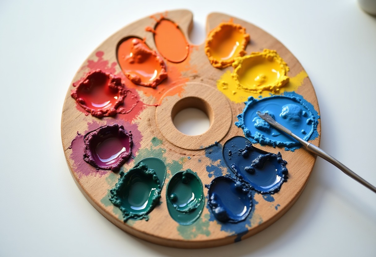
Warm colors contain traces of red and yellow, creating associations with fire, sunlight, and heat. In painting, these colors appear to move forward in space, making them ideal for focal points and foreground elements. Cadmium red, cadmium orange, cadmium yellow, raw sienna, and burnt sienna form the core warm palette, but their mixing behavior varies significantly based on their undertones.
When mixing warm colors, → Shop acrylic paint sets on Amazon pay attention to bias. Cadmium yellow leans slightly orange, making it perfect for mixing clean oranges but producing muddy greens when combined with blue. Lemon yellow contains blue bias, creating vibrant greens but dulling orange mixtures. This bias principle applies across all warm colors—understanding it prevents the muddy mixtures that plague intermediate painters.
Raw umber, despite being classified as earth tone, functions as a warm color due to its red-brown undertones. Mixed with warm yellows, it creates rich, earthy oranges perfect for autumn scenes or skin tones. Combined with warm reds, raw umber produces deep, chocolatey browns that maintain color vibrancy instead of turning gray.
Temperature mixing extends beyond pure hues. Adding tiny amounts of warm colors to predominantly cool mixtures creates sophisticated neutrals with temperature bias. A blue-gray mixed with a touch of burnt sienna becomes a warm gray that reads completely differently than the same gray mixed with blue and black.
Cool Colors: Creating Depth and Atmosphere
Cool colors contain blue undertones and naturally recede in paintings, making them essential for backgrounds, shadows, and atmospheric effects. Ultramarine blue, cerulean blue, viridian green, and dioxazine purple anchor the cool palette, each bringing specific mixing characteristics that affect temperature relationships.
Ultramarine blue contains red undertones, making it technically the warmest blue in most palettes. This red bias helps create luminous purples when mixed with reds and produces less muddy results in skin tone mixtures. Cerulean blue leans green, making it cooler and perfect for sky work or mixing brilliant greens with yellows.
The temperature bias principle becomes crucial when mixing cool colors with their warm counterparts. Understanding that viridian green contains blue bias explains why it mixes beautifully with blues to create ocean colors but turns muddy when combined with warm reds. For clean purple mixtures, pair ultramarine blue (warm blue) with alizarin crimson (cool red) rather than mixing cerulean blue with cadmium red.
Cool color mixing strategy involves using temperature to control saturation. → Shop oil paint tubes on Amazon Adding warm colors to cool mixtures doesn't just change temperature—it affects intensity. A small amount of burnt sienna in ultramarine blue creates a rich, atmospheric blue-gray perfect for distant mountains or shadow areas.
Warm vs Cool Color Comparison for Painting Applications
| Aspect | Warm Colors | Cool Colors | |--------|-------------|-------------| | Visual Effect | Advance forward, create intimacy | Recede backward, create space | | Best Applications | Focal points, foregrounds, highlights | Backgrounds, shadows, atmospheric effects | | Emotional Impact | Energy, excitement, comfort | Calm, stability, professionalism | | Mixing Behavior | Dominate mixtures, reduce easily | Maintain integrity, harder to overpower |
Essential Paint Sets and Tools for Color Temperature Control
Temperature control starts with the right paint selection. Quality matters more than quantity—six well-chosen colors with clear temperature biases outperform dozens of convenience hues. For acrylics, Liquitex Professional series offers excellent temperature clarity, while Winsor & Newton Artist's Oil Colours provide superior mixing consistency for oil painters.
→ Shop watercolor palettes on Amazon Watercolorists benefit from split-primary palettes containing warm and cool versions of each primary color. This approach—warm yellow (cadmium), cool yellow (lemon), warm red (cadmium), cool red (alizarin), warm blue (ultramarine), cool blue (cerulean)—enables clean secondary mixtures while maintaining temperature control.
→ Shop paint mixing medium on Amazon Mixing mediums extend working time, crucial for temperature blending. For oils, alkyd mediums speed drying while maintaining blendability. Acrylic painters should invest in slow-drying mediums or use a Why Wet Palette system to prevent rapid color shifts as paint dries.
Color wheel charts specifically designed for temperature relationships help visualize bias within color families. Unlike standard color wheels, temperature-focused charts show warm and cool versions of each hue, making temperature selection intuitive during the painting process.
→ Shop color wheel chart on Amazon Professional color wheels with temperature indicators eliminate guesswork, especially valuable when working under artificial lighting that can distort color perception.
Advanced Temperature Techniques Most Painters Miss
Temperature dominance creates compositional hierarchy more effectively than value contrast alone. Establish your painting's overall temperature first, then introduce opposing temperatures sparingly for maximum impact. A predominantly cool landscape with a single warm building draws attention more powerfully than a temperature-neutral scene with high value contrasts.
Reflected light carries the temperature of its source, creating sophisticated color relationships throughout your painting. Cool northern light bouncing off snow creates blue-violet shadows, while warm tungsten light reflected from interior walls adds orange undertones to shadow areas. Observing these temperature relationships in life transforms mechanical color application into naturalistic rendering.
Temperature gradation within single objects adds three-dimensional form more convincingly than value modeling alone. A warm highlight transitioning to cool shadows suggests both light direction and surface curvature. This technique works across all subjects—from portrait skin tones to still life drapery.
Atmospheric perspective relies on temperature shifts rather than just value changes. Distant objects become cooler and less saturated due to atmospheric particles scattering light. Incorporate this principle by gradually cooling and graying colors as they recede, maintaining color relationships while suggesting distance through temperature rather than detail reduction.
This approach ties directly to the techniques covered in Essential Paint Colors Mixing, where understanding color relationships enhances mixing efficiency and color harmony throughout your work.
FAQ
How do I know if a color is warm or cool when it seems neutral? Every color has temperature bias, even neutrals. Compare the questionable color to a known warm or cool color by placing them side by side. Gray mixed from ultramarine blue and burnt umber appears cool next to cadmium orange but warm next to cerulean blue. The bias becomes apparent through comparison rather than isolation. Pay attention to the color's undertones—does it lean toward red/orange (warm) or blue/green (cool)? This comparison method works for any color, including complex earth tones and mixed neutrals.
What's the biggest mistake painters make with color temperature? Using temperature randomly instead of establishing a dominant temperature scheme. Many intermediate painters add warm and cool colors equally throughout their paintings, creating visual chaos without hierarchy. Professional work typically maintains 70-80% dominance of either warm or cool temperature, using the opposite temperature sparingly for accent and contrast. This creates visual rest areas and powerful focal points. Random temperature placement destroys compositional unity and makes paintings appear amateurish despite good drawing and values.
Can I mix warm and cool colors together effectively? Absolutely, but understanding bias prevents muddy results. Mix warm and cool colors with similar bias for clean results—warm yellow (cadmium) with warm blue (ultramarine) creates cleaner greens than cool yellow (lemon) with warm blue. When mixing opposites intentionally, use tiny amounts of the minority color to maintain vibrancy. A touch of warm red in a cool blue mixture creates sophisticated purple-grays, but equal amounts produce dead, lifeless mud. The key is intentional proportion and understanding each color's bias before mixing.
How does lighting affect color temperature in my paintings? Light source temperature dramatically affects all colors in your painting. Warm tungsten lighting makes everything appear more orange, while cool fluorescent lighting adds blue-green casts. Outdoor northern light is cool, while direct sunlight is warm. Paint under consistent lighting and adjust your palette accordingly. If painting outdoors, note the light's temperature and exaggerate it slightly in your work. Indoor painters should use daylight-balanced LED lights to maintain color accuracy, especially when working with temperature-sensitive subjects like portraits or still life setups.
Should I premix warm and cool versions of every color? Premixing temperature variants saves time and ensures consistency, especially for large paintings or series work. Create warm and cool versions of your most-used colors—a warm gray (mixed with burnt umber) and cool gray (mixed with blue), warm green (yellow bias) and cool green (blue bias). However, don't premix everything, as spontaneous mixing often produces more vibrant results. Focus on premixing neutrals and secondary colors you use repeatedly, while mixing primaries fresh for maximum intensity. This approach balances efficiency with color vibrancy throughout your painting process.
Master color temperature relationships and watch your paintings develop the visual sophistication that separates professional work from amateur efforts.
Some links on this page are affiliate links. We may earn a small commission if you purchase through them, at no extra cost to you.
As an Amazon Associate we earn from qualifying purchases. This article contains affiliate links; if you buy through them we may earn a small commission at no additional cost to you.