Most painters waste money buying dozens of tube colors they rarely use, when twelve essential colors can mix virtually every hue needed for stunning artwork. Professional artists have known this secret for centuries: a strategic palette of carefully chosen pigments creates more harmonious paintings than random color collections ever could.
Why Strategic Color Selection Beats Random Tube Collecting
Color mixing follows precise principles rooted in pigment chemistry and optical theory. The traditional color wheel taught in art schools represents additive light mixing, but paint mixing follows subtractive principles where pigments absorb specific wavelengths. Understanding this difference transforms how you approach palette building.
Winsor & Newton's technical research demonstrates that certain pigment combinations produce cleaner mixtures while others create muddy results. Single-pigment colors mix more predictably than convenience mixtures, which often contain multiple pigments that interfere with clean color mixing.
The key lies in selecting colors with maximum mixing potential. Three true primaries theoretically mix every color, but paint pigments aren't perfect primaries. Real-world mixing requires a split-primary palette: warm and cool versions of each primary color, plus strategic additions that fill mixing gaps.
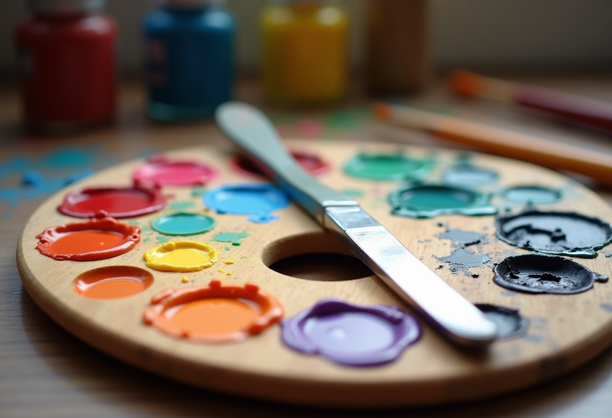
The Complete Essential Color Palette
Your core twelve colors should include three categories: split primaries, essential secondaries, and mixing enhancers. This combination provides maximum versatility while maintaining color harmony.
Split Primaries (6 colors):
- Cadmium Red Light (warm red)
- Alizarin Crimson (cool red)
- Cadmium Yellow Light (warm yellow)
- Lemon Yellow (cool yellow)
- Ultramarine Blue (warm blue)
- Phthalo Blue (cool blue)
Essential Secondaries (3 colors):
- Cadmium Orange
- Viridian Green
- Dioxazine Purple
Mixing Enhancers (3 colors):
- Titanium White
- Ivory Black
- Raw Umber
This palette works across all major paint types. → Shop acrylic paint sets on Amazon for ready-made collections, or build your palette with individual tubes for maximum quality control.
Quality matters significantly for color mixing. Student-grade paints contain less pigment and more filler, producing weak mixtures. Professional-grade paints like Golden Heavy Body or Winsor & Newton Artist's deliver consistent results with predictable mixing behavior.
Color Temperature and Mixing Dynamics
Understanding warm and cool color temperatures revolutionizes mixing success. Each primary exists in warm and cool versions that lean toward adjacent colors on the color wheel.
| Color | Warm Version | Cool Version | Best Mixtures | |-------|-------------|--------------|---------------| | Red | Cadmium Red Light | Alizarin Crimson | Warm: bright oranges. Cool: clear purples | | Yellow | Cadmium Yellow Light | Lemon Yellow | Warm: rich oranges. Cool: spring greens | | Blue | Ultramarine Blue | Phthalo Blue | Warm: rich purples. Cool: bright greens | | Secondary | Purpose | Mixing Notes | When Essential | | Orange | Bridge warm colors | Use sparingly | Sunset scenes, portraits | | Green | Natural mixing base | Modify with primaries | Landscapes, foliage | | Purple | Shadow enhancement | Small amounts transform grays | Dramatic lighting |
Temperature mixing creates more sophisticated color relationships than single-temperature palettes. Warm colors advance visually while cool colors recede, creating natural depth in paintings.
The secret to clean secondary mixtures lies in using primaries from the same temperature family. Mix Cadmium Yellow Light with Cadmium Red Light for vibrant oranges, but combine Lemon Yellow with Phthalo Blue for electric greens. Cross-temperature mixing produces more subdued, complex colors perfect for natural subjects.
→ Shop oil paint primary colors on Amazon for traditional oil techniques, or explore watercolor options for transparent mixing effects.
Professional Color Mixing Tools and Techniques
Your mixing tools affect color quality as much as paint selection. Glass palettes provide the smoothest mixing surface for oils and acrylics, while ceramic plates work well for watercolors. Avoid paper plates, which absorb oil and contaminate mixtures.
Palette Organization: Arrange colors around your mixing surface in color wheel order: yellows, oranges, reds, purples, blues, greens. Keep white and black separate to prevent accidental contamination. This system speeds color location and prevents muddy mixtures.
→ Shop watercolor mixing palette on Amazon for dedicated watercolor mixing surfaces that prevent color bleeding.
Mixing Ratios: Start with the lighter color when mixing unequal values. Adding dark to light requires less paint than the reverse. Phthalo Blue, for example, dominates mixtures—use tiny amounts when creating greens or grays.
Color Strings: Create gradual color transitions by mixing a series of intermediate steps between two colors. This technique, used in portrait work and landscape painting, produces smoother color harmony than abrupt color changes.
The wet palette technique, detailed in our Why Wet Palette guide, keeps acrylic colors workable during extended mixing sessions. This tool becomes essential when developing complex color relationships.
→ Shop artist paint tubes on Amazon in sizes that match your usage patterns—larger tubes for frequently mixed colors, smaller tubes for specialty pigments.
Advanced Mixing Secrets Most Painters Miss
Professional colorists employ techniques that dramatically improve color harmony beyond basic mixing rules. These methods separate amateur work from professional results.
Optical Mixing: Place small touches of different colors adjacent to each other rather than pre-mixing them on the palette. Viewed from proper distance, the eye blends these colors optically, creating more vibrant results than physical mixing. Impressionist painters mastered this technique for capturing light effects.
Broken Color Technique: Instead of flat color areas, apply multiple related colors to create visual texture. A "green" tree might contain yellow-greens, blue-greens, and touches of complementary red in shadow areas. This approach creates more realistic, atmospheric effects.
Temperature Shifts: Gradually shift color temperature across forms to suggest light direction and atmospheric perspective. Warm colors in light areas, cool colors in shadows, with gradual transitions between them.
Chromatic Grays: Mix grays using complementary colors instead of black and white. Red and green mixtures create warm grays perfect for shadow areas. Blue and orange combinations produce cool grays ideal for atmospheric effects. These chromatic grays integrate better with surrounding colors than neutral grays.
→ Shop color mixing palette knife on Amazon for smooth, controlled color blending without brush marks.
Simultaneous Contrast: Colors appear different depending on surrounding hues. A gray appears warm next to cool blues but cool next to warm oranges. Professional painters exploit this phenomenon to make colors appear more vibrant without actually mixing brighter pigments.
These techniques work with any quality paint system, from the professional setups detailed in our Best Beginner Miniature Paints 2026 guide to traditional fine art applications.
FAQ
Q: How many colors do I really need to start mixing effectively?
The absolute minimum is six colors: warm and cool versions of each primary (red, yellow, blue), plus white. This split-primary palette mixes most colors you'll need for realistic painting. Add black for convenience, though mixing dark colors from primaries often produces more vibrant results. Professional painters often work with just these seven colors for entire paintings, proving that strategic selection beats random accumulation.
Q: Why do my mixed colors look muddy compared to tube colors?
Muddy mixtures usually result from mixing too many colors together or combining pigments with conflicting undertones. Limit mixtures to two or three colors maximum. Check your pigments—some "primary" colors are actually mixtures themselves, containing multiple pigments that interfere with clean mixing. Single-pigment colors like Cadmium Red, Ultramarine Blue, and Cadmium Yellow produce cleaner mixtures than convenience colors like "Brilliant Red" or "Sky Blue."
Q: Should I buy the same essential colors in different paint types?
Absolutely. Each paint medium handles differently but follows the same color mixing principles. Your essential palette should remain consistent across acrylics, oils, and watercolors, though specific pigment formulations vary between manufacturers. This consistency helps you predict color behavior regardless of medium. Start with one medium, master these twelve colors, then expand to other paint types using the same color framework.
Q: How do I know if I'm using the right mixing ratios?
Practice mixing specific color targets using measured amounts of paint. Start with equal amounts of two colors, then adjust by adding small amounts of one color until you achieve the desired result. Document successful ratios for future reference. Professional colorists often keep mixing notes with specific pigment combinations and ratios. Remember that strong pigments like Phthalo Blue and Alizarin Crimson dominate mixtures—use them sparingly.
Q: Can I substitute cheaper student-grade paints for professional colors in my essential palette?
Student-grade paints work for learning color relationships, but they limit mixing quality due to lower pigment concentration and added fillers. Professional-grade paints contain more pure pigment, producing stronger, cleaner mixtures with better consistency. If budget constraints require student-grade paints, prioritize professional-grade versions of your most-used mixing colors: Titanium White, your preferred blue, and your go-to yellow. These colors appear in nearly every mixture, so their quality significantly impacts final results.
Master these twelve essential colors and their mixing relationships, and you'll create more harmonious paintings than painters with dozens of random tubes ever achieve.
Some links on this page are affiliate links. We may earn a small commission if you purchase through them, at no extra cost to you.